- NativeScript 教程
- NativeScript - 主页
- NativeScript - 简介
- NativeScript - 安装
- NativeScript - 架构
- NativeScript - 角度应用程序
- NativeScript - 模板
- NativeScript - 小部件
- NativeScript - 布局容器
- NativeScript - 导航
- NativeScript - 事件处理
- NativeScript - 数据绑定
- NativeScript - 模块
- NativeScript - 插件
- NativeScript - 使用 JavaScript 的本机 API
- NativeScript - 在 Android 中创建应用程序
- NativeScript - 在 iOS 中创建应用程序
- NativeScript - 测试
- NativeScript 有用资源
- NativeScript - 快速指南
- NativeScript - 有用的资源
- NativeScript - 讨论
NativeScript - 小部件
NativeScript 提供了大量的用户界面组件,称为“小部件”。每个小部件都执行一项特殊任务并附带一组方法。让我们在本节中详细了解 NativeScript 小部件。
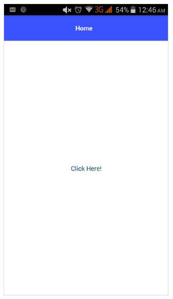
按钮
Button 是执行点击事件动作的组件。当用户点击按钮时,它会执行相应的操作。它的定义如下 -
<Button text="Click here!" tap="onTap"></Button>
让我们在 BlankNgApp 中添加按钮,如下所示 -
步骤1
打开src\app\home\home.component.html。这是我们的 home 组件的 UI 设计页面。
第2步
在GirdLayout组件内添加一个按钮。完整代码如下 -
<ActionBar>
   <Label text="Home"></Label>
</ActionBar>
<GridLayout>
   <button text="Click Here!"></button>
</GridLayout>
输出
以下是按钮的输出 -
步骤3
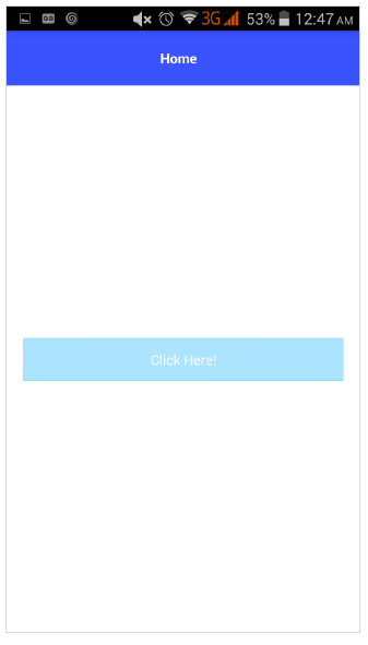
我们可以使用 CSS 设置按钮的样式,如下所示 -
<ActionBar>
   <Label text="Home"></Label>
</ActionBar>
<GridLayout>
   <button text="Click Here!" class="-primary"></button>
</GridLayout>
这里,-primary类用于表示主按钮。
输出
以下是ButtonPrimary的输出-
步骤4
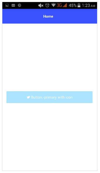
NativeScript 提供格式化选项以在按钮中提供自定义图标。示例代码如下 -
<GridLayout>
<Button class="-primary">
<FormattedString>
<Span text="" class="fa"></Span>
<Span text=" Button.-primary with icon"></Span>
</FormattedString>
</Button>
</GridLayout>
.fa {
font-family: "FontAwesome", "fontawesome-webfont";
}
这里,
指定图标在字体 FontAwesome 中的位置。下载最新的 Font Awesome 字体并将 fontawesome-webfont.ttf 放在 src\fonts 文件夹中。
输出
以下是ButtonPrimary的输出-
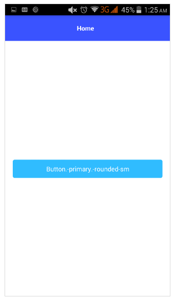
步骤5
可以使用以下语法创建圆形按钮 -
<Button text="Button.-primary.-rounded-sm" class="-primary -rounded-sm"></Button>
输出
以下是 ButtonPrimary 的输出 -
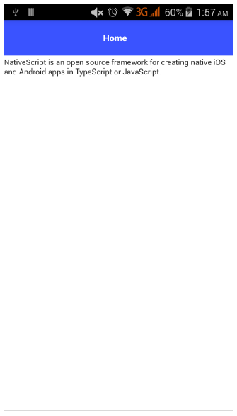
标签
Label组件用于显示静态文本。更改主页如下 -
<GridLayout>
   <Label text="NativeScript is an open source framework for creating native iOS and Android apps in TypeScript or JavaScript." textWrap="true">
   </Label>
</GridLayout>
在这里,如果标签超出屏幕宽度,则 textWrap 会包裹标签的内容。
输出
以下是标签的输出 -
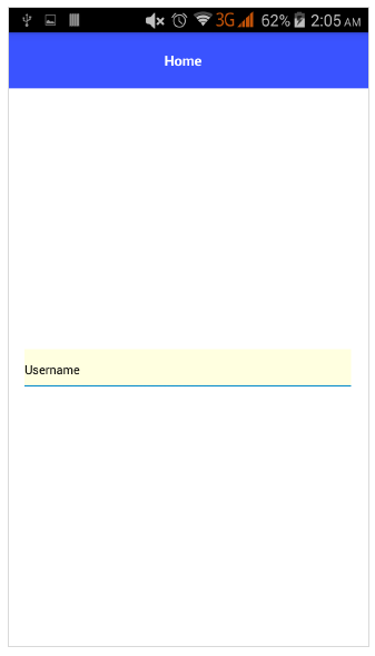
文本域
TextField 组件用于从用户获取信息。让我们更改我们的主页,如下所示 -
<GridLayout>
   <TextField hint="Username"
      color="lightblue"
      backgroundColor="lightyellow"
      height="75px">
   </TextField>
</GridLayout>
这里,
color 代表文字颜色
backgroundColor代表文本框的背景
height表示文本框的高度
输出
以下是文本字段的输出 -
文本视图
TextView组件用于从用户获取多行文本内容。让我们更改我们的主页,如下所示 -
<GridLayout>
   <TextView loaded="onTextViewLoaded" hint="Enter text" returnKeyType="done" autocorrect="false" maxLength="100">
   </TextView>
</GridLayout>
这里, maxLength 表示TextView接受的最大长度。
输出
以下是 TextView 的输出 -
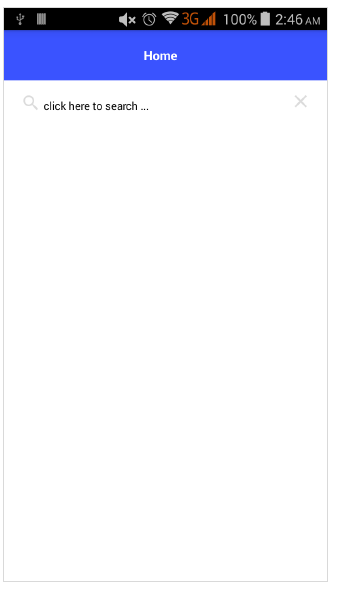
搜索栏
该组件用于搜索任何查询或提交任何请求。它的定义如下 -
<StackLayout>
   <SearchBar id="bar" hint="click here to search ..."></SearchBar>
<StackLayout>
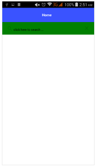
我们可以应用样式 -
<StackLayout>
   <SearchBar id="bar" hint="click here to search ..." color="green" backgroundColor="green"></SearchBar>
</StackLayout>
以下是 SearchBarStyle 的输出 -
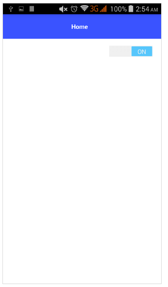
转变
Switch是基于toggle来在选项之间进行选择的。默认状态为 false。它的定义如下 -
<StackLayout>
   <Switch checked="false" loaded="onSwitchLoaded"></Switch>
</StackLayout>
上述程序的输出如下所示 -
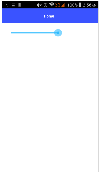
滑块
Slider 是一个用于选择数值范围的滑动组件。它的定义如下 -
<Slider value="30" minValue="0" maxValue="50" loaded="onSliderLoaded"></Slider>
上述程序的输出如下 -
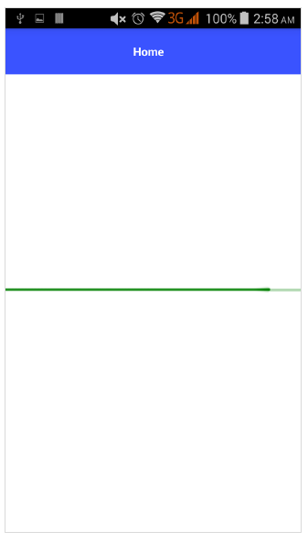
进步
进度小部件指示操作的进度。当前进度以条形表示。它的定义如下 -
<StackLayout verticalAlign="center" height="50">
   <Progress value="90" maxValue="100" backgroundColor="red" color="green" row="0"></Progress>
</StackLayout>
以下是进度小部件的输出 -
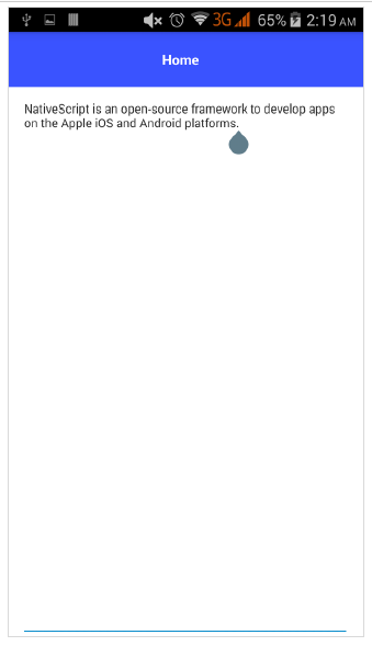
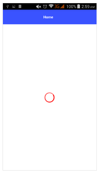
活动指示器
ActivityIndicator 显示正在进行的任务。它的定义如下 -
<StackLayout verticalAlign="center" height="50">
   <ActivityIndicator busy="true" color="red" width="50"
   height="50"></ActivityIndicator>
</StackLayout>
以下是 ActivityIndicator 的输出 -
图像
图像小部件用于显示图像。可以使用“ImageSource”url 加载它。它的定义如下 -
<StackLayout class="m-15" backgroundColor="lightgray">
   <Image src="~/images/logo.png" stretch="aspectFill"></Image>
</StackLayout>
图像小部件的输出如下所示 -
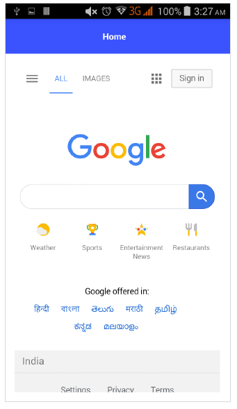
网页视图
WebView 显示网页。可以使用 URL 加载网页。它的定义如下 -
<WebView row="1" loaded="onWebViewLoaded" id="myWebView" src="http://www.google.com"></WebView>
上述代码的输出如下所示 -
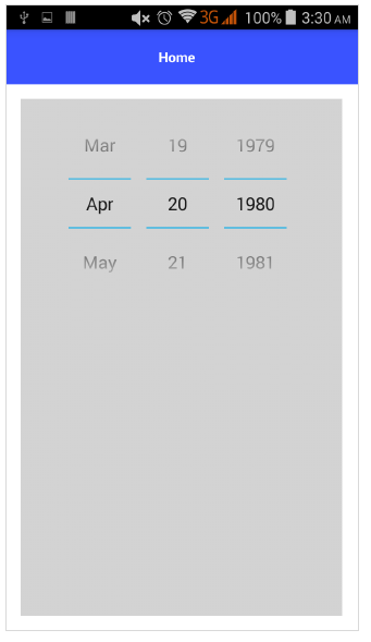
日期选择器
DatePicker 组件用于选择日期。它的定义如下 -
<StackLayout class="m-15" backgroundColor="lightgray">
   <DatePicker year="1980" month="4" day="20" verticalAlignment="center"></DatePicker>
</StackLayout>
DatePicker 组件的输出如下所示 -
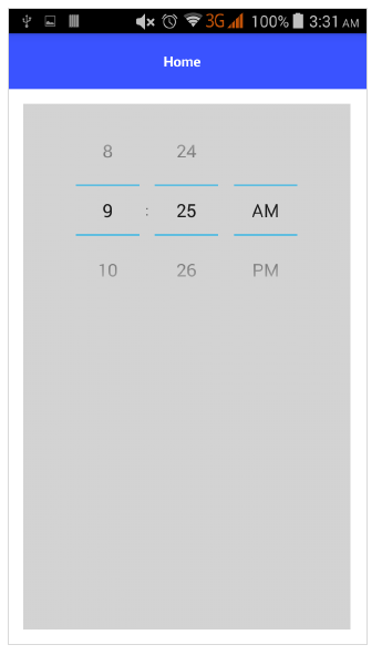
时间选择器
TimePicker 组件用于选择时间。它的定义如下 -
<StackLayout class="m-15" backgroundColor="lightgray">
<TimePicker hour="9"
   minute="25"
   maxHour="23"
   maxMinute="59"
   minuteInterval="5">
</TimePicker>
</StackLayout>
以下是 TimePicker 组件的输出 -