- jQuery Mobile Tutorial
- jQuery Mobile - Home
- jQuery Mobile - Overview
- jQuery Mobile - Setup
- jQuery Mobile - Pages
- jQuery Mobile - Icons
- jQuery Mobile - Transitions
- jQuery Mobile - Layouts
- jQuery Mobile - Widgets
- jQuery Mobile - Events
- jQuery Mobile - Forms
- jQuery Mobile - Themes
- jQuery Mobile - CSS Classes
- jQuery Mobile - Data Attributes
- jQuery Mobile Useful Resources
- jQuery Mobile - Interview Questions
- jQuery Mobile - Quick Guide
- jQuery Mobile - Useful Resources
- jQuery Mobile - Discussion
jQuery Mobile - 设置
在本章中,我们将讨论如何安装和设置 jQuery Mobile。
下载 jQuery 移动
当您打开链接jquerymobile.com/时,您将看到有两个下载 jQuery 移动库的选项。
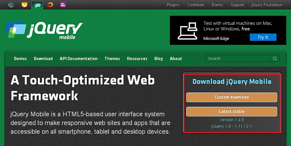
自定义下载- 单击此按钮可下载库的自定义版本。
最新稳定版- 单击此按钮可获得 jQuery 移动库的稳定版和最新版本。
使用下载生成器自定义下载
使用下载生成器,您可以创建仅包含您需要的库部分的自定义构建。当您下载这个新的自定义版本的 jQuery Mobile 时,您将看到以下屏幕。
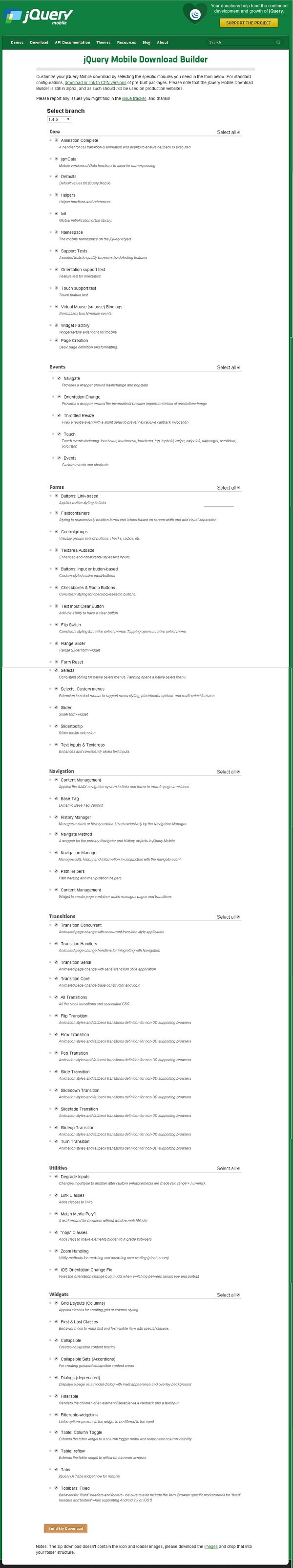
您可以根据需要选择库,然后单击“构建我的下载”按钮。
下载稳定
单击“稳定”按钮,将直接转到包含 CSS 和 JQuery 文件的 ZIP 文件,以获得最新版本的 jQuery 移动库。将 ZIP 文件内容提取到 jQuery 移动目录。
该版本包含所有文件,包括所有依赖项、大量演示,甚至是库的单元测试套件。该版本有助于入门。
从 CDN 下载 jQuery 库
CDN(内容交付网络)是一个服务器网络,旨在为用户提供文件服务。如果您在网页中使用 CDN 链接,则会将托管文件的责任从您自己的服务器转移到一系列外部服务器。这还有一个优点,即如果您网页的访问者已经从同一 CDN 下载了 jQuery mobile 的副本,则无需重新下载。您可以将以下 CDN 文件包含到 HTML 文档中。
//The jQuery Mobile CSS theme file (optional, if you are overriding the default theme)
<link rel = "stylesheet" href = "https://code.jquery.com/mobile/1.4.5/jquery.mobile-1.4.5.min.css">

//The jQuery core JavaScript file
<script src = "https://code.jquery.com/jquery-1.11.3.min.js"></script>

//The jQuery Mobile core JavaScript file
<script src = "https://code.jquery.com/mobile/1.4.5/jquery.mobile-1.4.5.min.js"></script>
我们在本教程中使用该库的 CDN 版本。我们使用 AMPPS(AMPPS 是 Apache、MySQL、MongoDB、PHP、Perl 和 Python 的 WAMP、MAMP 和 LAMP 堆栈)服务器来执行我们所有的示例。
例子
以下是 jQuery Mobile 的一个简单示例。
<!DOCTYPE html>
<html>
   <head>
      <meta name = "viewport" content = "width = device-width, initial-scale = 1">
      <link rel = "stylesheet" href = "https://code.jquery.com/mobile/1.4.5/jquery.mobile-1.4.5.min.css">
      <script src = "https://code.jquery.com/jquery-1.11.3.min.js"></script>
      <script src = "https://code.jquery.com/mobile/1.4.5/jquery.mobile-1.4.5.min.js"></script>
   </head>


   <body>
      <div data-role = "page" id = "pageone">
         <div data-role = "header">
            <h1>Header Text</h1>
         </div>

         <div data-role = "main" class = "ui-content">
            <h2>Welcome to TutorialsPoint</h2>
         </div>

         <div data-role = "footer">
            <h1>Footer Text</h1>
         </div>
      </div>
   </body>
</html>
上述代码的详细信息是 -
该代码在 head 元素内指定。
<meta name = "viewport" content = "width = device-width, initial-scale = 1">
视口用于(由浏览器)指定显示页面的缩放级别和尺寸。
content="width=device-width" 用于设置页面或屏幕设备的像素宽度。
首次加载页面时,initial-scale = 1 设置初始缩放级别。
包括以下 CDN
<link rel = "stylesheet" href = "https://code.jquery.com/mobile/1.4.5/jquery.mobile-1.4.5.min.css">
<script src = "https://code.jquery.com/jquery-1.11.3.min.js"></script>
<script src = "https://code.jquery.com/mobile/1.4.5/jquery.mobile-1.4.5.min.js"></script>
<body> 标签内的内容是浏览器中显示的页面。
<div data-role = "page">
   ...
</div>
data-role = "header"在页面顶部创建标题。
data-role = "main"用于定义页面的内容。
data-role = "footer"在页面底部创建页脚。
class = "ui-content"包括页面内容内的填充和边距。
输出
让我们执行以下步骤来看看上面的代码是如何工作的 -
将上述 html 代码保存为服务器根文件夹中的simple_example.html文件。
以 http://localhost/simple_example.html 打开此 HTML 文件,将显示以下输出。