- CSS 教程
- CSS - 主页
- CSS - 简介
- CSS - 语法
- CSS - 包含
- CSS - 测量单位
- CSS - 颜色
- CSS - 背景
- CSS - 字体
- CSS - 文本
- CSS - 图像
- CSS - 链接
- CSS - 表格
- CSS - 边框
- CSS - 边距
- CSS - 列表
- CSS - 填充
- CSS - 光标
- CSS - 轮廓
- CSS - 尺寸
- CSS - 滚动条
- CSS - 内联块
- CSS - 下拉菜单
- CSS - 可见性
- CSS - 溢出
- CSS-Clearfix
- CSS-浮动
- CSS - 箭头
- CSS - 调整大小
- CSS - 引号
- CSS - 顺序
- CSS - 位置
- CSS - 连字符
- CSS - 悬停
- CSS - 显示
- CSS - 焦点
- CSS - 缩放
- CSS - 翻译
- CSS - 高度
- CSS - 宽度
- CSS - 不透明度
- CSS - Z 索引
- CSS - 底部
- CSS - 导航栏
- CSS - 叠加
- CSS - 表单
- CSS - 对齐
- CSS - 图标
- CSS - 图标
- CSS - 图片库
- CSS - 注释
- CSS - 加载器
- CSS - 属性选择器
- CSS - 组合器
- CSS-根
- CSS - 盒子模型
- CSS - 计数器
- CSS - 剪辑
- CSS - 书写模式
- CSS - Unicode-bidi
- CSS 高级
- CSS-弹性盒
- CSS - 可见性
- CSS - 定位
- CSS - 层
- CSS - 伪类
- CSS - 伪元素
- CSS - @规则
- CSS - 文本效果
- CSS - 媒体类型
- CSS - 分页媒体
- CSS-听觉媒体
- CSS - 打印
- CSS - 布局
- CSS - 验证
- CSS - 图像精灵
- CSS - 重要
- CSS3 教程
- CSS3 - 教程
- CSS3 - 圆角
- CSS3 - 边框图像
- CSS3 - 多背景
- CSS3 - 颜色
- CSS3 - 渐变
- CSS3 - 阴影
- CSS3 - 文本
- CSS3 - 网页字体
- CSS3 - 二维变换
- CSS3 - 3D 变换
- CSS3 - 动画
- CSS3 - 多列
- CSS3 - 用户界面
- CSS3 - 盒子尺寸
- CSS 响应式
- CSS - 响应式网页设计
- CSS 资源
- CSS - 有用的资源
- CSS - 讨论
CSS - 响应式
CSS3 响应式网页设计
响应式网页设计提供最佳体验、轻松阅读和轻松导航,并且在不同设备(例如桌面、移动设备和标签页)上调整大小最少。
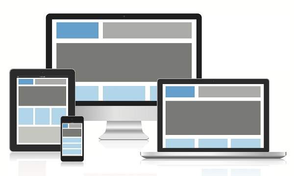
响应式结构
下图显示了网页的响应式结构。
灵活的网格演示
<html>
   <head>
      <style>
         body {
            font: 600 14px/24px "Open Sans",
               "HelveticaNeue-Light",
               "Helvetica Neue Light",
               "Helvetica Neue",
               Helvetica, Arial,
               "Lucida Grande",
               Sans-Serif;
         }
         h1 {
            color: #9799a7;
            font-size: 14px;
            font-weight: bold;
            margin-bottom: 6px;
         }
         .container:before, .container:after {
            content: "";
            display: table;
         }
         .container:after {
            clear: both;
         }
         .container {
            background: #eaeaed;
            margin-bottom: 24px;
            *zoom: 1;
         }
         .container-75 {
            width: 75%;
         }
         .container-50 {
            margin-bottom: 0;
            width: 50%;
         }
         .container, section, aside {
            border-radius: 6px;
         }
         section, aside {
            background: #2db34a;
            color: #fff;
            margin: 1.858736059%;
            padding: 20px 0;
            text-align: center;
         }
         section {
            float: left;
            width: 63.197026%;
         }
         aside {
            float: right;
            width: 29.3680297%;
         }
      </style>
   </head>

   <body>

      <h1>100% Wide Container</h1>

      <div class = "container">
         <section>Section</section>
         <aside>Aside</aside>
      </div>

      <h1>75% Wide Container</h1>

      <div class = "container container-75">
         <section>Section</section>
         <aside>Aside</aside>
      </div>

      <h1>50% Wide Container</h1>

      <div class = "container container-50">
         <section>Section</section>
         <aside>Aside</aside>
      </div>

   </body>
</html>
它将产生以下结果 -
媒体查询
媒体查询针对不同尺寸的设备(例如手机、台式机等)采用不同的样式规则,
<html>
   <head>
      <style>
         body {
            background-color: lightpink;
         }
         @media screen and (max-width: 420px) {
            body {
               background-color: lightblue;
            }
         }
      </style>
   </head>

   <body>
      <p>
         If screen size is less than 420px, then it will show lightblue
         color, or else it will show light pink color
      </p>
   </body>
</html>
它将产生以下结果 -
Bootstrap 响应式网页设计
Bootstrap 是基于 HTML、CSS 和 Java 脚本的最流行的网页设计框架,它可以帮助您以响应方式设计适用于所有设备的网页。
<html>
   <head>
      <meta charset = "utf-8">
      <meta name = "viewport" content = "width=device-width, initial-scale = 1">
      <link rel = "stylesheet"
         href = "http://maxcdn.bootstrapcdn.com/bootstrap/3.2.0/css/bootstrap.min.css">
      <style>
         body {
            color:green;
         }
      </style>
   </head>

   <body>

      <div class = "container">

         <div class = "jumbotron">
            <h1>Tutorials point</h1>
            <p>
               Tutorials Point originated from the idea that there exists a class
               of readers who respond better to online content and prefer to learn
               new skills at their own pace from the comforts of their drawing rooms.
            </p>
         </div>

         <div class = "row">
            <div class = "col-md-4">
               <h2>Android</h2>
               <p>
                  Android is an open source and Linux-based operating system for mobile
                  devices such as smartphones and tablet computers. Android was developed
                  by the Open Handset Alliance, led by Google, and other companies.
               </p>
         </div>

         <div class = "col-md-4">
            <h2>CSS</h2>
            <p>
               Cascading Style Sheets, fondly referred to as CSS, is a simple design
               language intended to simplify the process of making web pages presentable.
            </p>
         </div>

         <div class = "col-md-4">
            <h2>Java</h2>
            <p>
               Java is a high-level programming language originally developed by Sun
               Microsystems and released in 1995. Java runs on a variety of platforms,
               such as Windows, Mac OS, and the various versions of UNIX. This tutorial
               gives a complete understanding of Java.
            </p>
         </div>
      </div>

   </body>
</html>
它将产生以下结果 -