- 角度材质 7 教程
- Angular Material 7 - 主页
- Angular 材料 7 - 概述
- 环境设置
- 表单控件
- Angular Material 7 - 自动完成
- Angular 材质 7 - 复选框
- Angular Material 7 - 日期选择器
- Angular Material 7 - 表单字段
- 角度材质 7 - 输入
- Angular Material 7 - 单选按钮
- 角度材质 7 - 选择
- 角度材料 7 - 滑块
- Angular Material 7 - 切换滑块
- 导航
- Angular 材质 7 - 菜单
- Angular Material 7 - 侧面导航
- Angular Material 7 - 工具栏
- 布局
- 角度材料 7 - 卡片
- 角度材料 7 - 分隔线
- Angular Material 7 - 扩展面板
- Angular Material 7 - 网格列表
- Angular 材质 7 - 列表
- 角度材料 7 - 步进器
- Angular Material 7 - 选项卡
- 角度材质 7 - 树
- 按钮和指示灯
- 角度材质 7 - 按钮
- Angular Material 7 - 按钮切换
- Angular Material 7 - 徽章
- 角材料 7 - 芯片
- Angular Material 7 - 图标
- Angular Material 7 - 进度旋转器
- Angular Material 7 - 进度条
- 角度材质 7 - 波纹
- 弹出窗口和模态窗口
- Angular Material 7 - SnackBar
- Angular Material 7 - 工具提示
- 数据表
- Angular Material 7 - 分页器
- Angular Material 7 - 排序标题
- 角材料 7 - 表格
- Angular Material 7 资源
- Angular Material 7 - 快速指南
- Angular Material 7 - 资源
- Angular Material 7 - 讨论
角度材质 7 - 输入
<mat-input>是一个 Angular 指令,用于 <input> 和 <textarea> 元素在<mat-form-field>下工作。
以下输入类型可以在<mat-input>中使用。
- 颜色
- 日期
- 日期时间本地
- 电子邮件
- 月
- 数字
- 密码
- 搜索
- 电话
- 文本
- 时间
- 网址
- 星期
在本章中,我们将展示在 Angular Material 中使用 mat-input 控件所需的配置。
创建角度应用程序
按照以下步骤更新我们在Angular 6 - 项目设置章节中创建的 Angular 应用程序 -
| 步 | 描述 |
|---|---|
| 1 | 创建一个名为materialApp的项目,如Angular 6 - 项目设置一章中所述。 |
| 2 | 修改app.module.ts、app.component.ts、app.component.css和app.component.html,如下所述。保持其余文件不变。 |
| 3 | 编译并运行应用程序以验证实现逻辑的结果。 |
以下是修改后的模块描述符app.module.ts的内容。
import { BrowserModule } from '@angular/platform-browser';
import { NgModule } from '@angular/core';
import { AppComponent } from './app.component';
import {BrowserAnimationsModule} from '@angular/platform-browser/animations';
import {MatInputModule} from '@angular/material'
import {FormsModule, ReactiveFormsModule} from '@angular/forms';
@NgModule({
   declarations: [
      AppComponent
   ],
   imports: [
      BrowserModule,
      BrowserAnimationsModule,
      MatInputModule,
      FormsModule,
      ReactiveFormsModule
   ],
   providers: [],
   bootstrap: [AppComponent]
})
export class AppModule { }
以下是修改后的 CSS 文件app.component.css的内容。
.tp-form {
   min-width: 150px;
   max-width: 500px;
   width: 100%;
}
.tp-full-width {
   width: 100%;
}
以下是修改后的 ts 文件app.component.ts的内容。
import { Component } from '@angular/core';
import { FormControl } from "@angular/forms";
import {Validators} from '@angular/forms';
@Component({
   selector: 'app-root',
   templateUrl: './app.component.html',
   styleUrls: ['./app.component.css']
})
export class AppComponent {
   title = 'materialApp';
   emailFormControl = new FormControl('', [
      Validators.required,
      Validators.email,
  ]);
}
以下是修改后的 HTML 主机文件app.component.html的内容。
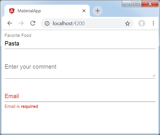
<form class = "tp-form">
   <mat-form-field class = "tp-full-width">
      <input matInput placeholder = "Favorite Food" value = "Pasta">
   </mat-form-field>
   <mat-form-field class = "tp-full-width">
      <textarea matInput placeholder = "Enter your comment"></textarea>
   </mat-form-field>
   <mat-form-field class = "tp-full-width">
      <input matInput placeholder = "Email" [formControl] = "emailFormControl">
      <mat-error *ngIf = "emailFormControl.hasError('email')
         && !emailFormControl.hasError('required')">
         Please enter a valid email address
      </mat-error>
      <mat-error *ngIf = "emailFormControl.hasError('required')">
         Email is <strong>required</strong>
      </mat-error>
   </mat-form-field>
</form>
结果
验证结果。
细节
首先,我们使用 mat-form-field 包装器创建了一个表单字段。
然后,使用 input 和 matInput 属性将表单控件添加到表单字段。