- CSS 教程
- CSS - 主页
- CSS - 简介
- CSS - 语法
- CSS - 包含
- CSS - 测量单位
- CSS - 颜色
- CSS - 背景
- CSS - 字体
- CSS - 文本
- CSS - 图像
- CSS - 链接
- CSS - 表格
- CSS - 边框
- CSS - 边距
- CSS - 列表
- CSS - 填充
- CSS - 光标
- CSS - 轮廓
- CSS - 尺寸
- CSS - 滚动条
- CSS - 内联块
- CSS - 下拉菜单
- CSS - 可见性
- CSS - 溢出
- CSS-Clearfix
- CSS-浮动
- CSS - 箭头
- CSS - 调整大小
- CSS - 引号
- CSS - 顺序
- CSS - 位置
- CSS - 连字符
- CSS - 悬停
- CSS - 显示
- CSS - 焦点
- CSS - 缩放
- CSS - 翻译
- CSS - 高度
- CSS - 宽度
- CSS - 不透明度
- CSS - Z 索引
- CSS - 底部
- CSS - 导航栏
- CSS - 叠加
- CSS - 表单
- CSS - 对齐
- CSS - 图标
- CSS - 图标
- CSS - 图片库
- CSS - 注释
- CSS - 加载器
- CSS - 属性选择器
- CSS - 组合器
- CSS-根
- CSS - 盒子模型
- CSS - 计数器
- CSS - 剪辑
- CSS - 书写模式
- CSS - Unicode-bidi
- CSS 高级
- CSS-弹性盒
- CSS - 可见性
- CSS - 定位
- CSS - 层
- CSS - 伪类
- CSS - 伪元素
- CSS - @规则
- CSS - 文本效果
- CSS - 媒体类型
- CSS - 分页媒体
- CSS-听觉媒体
- CSS - 打印
- CSS - 布局
- CSS - 验证
- CSS - 图像精灵
- CSS - 重要
- CSS3 教程
- CSS3 - 教程
- CSS3 - 圆角
- CSS3 - 边框图像
- CSS3 - 多背景
- CSS3 - 颜色
- CSS3 - 渐变
- CSS3 - 阴影
- CSS3 - 文本
- CSS3 - 网页字体
- CSS3 - 二维变换
- CSS3 - 3D 变换
- CSS3 - 动画
- CSS3 - 多列
- CSS3 - 用户界面
- CSS3 - 盒子尺寸
- CSS 响应式
- CSS - 响应式网页设计
- CSS 资源
- CSS - 有用的资源
- CSS - 讨论
CSS - 单位
CSS 中的值和单位非常重要,因为它们决定了网页上元素的大小、比例和位置。
CSS 单位,定义用于指定值的测量系统。CSS 提供了许多不同的单位来表示长度和测量。CSS 单元用于指定页面元素或其内容的属性大小。
CSS 中有多种指定和测量长度的方法。它用于指定边距、填充、字体大小、宽度、高度、边框等。
例如- font-size: 50px,这里的数字50有一个后缀px,即像素,它是一个CSS测量单位。
数字和单位之间不应有空格。当值为 0 时,可以省略单位。
下表显示了我们在 CSS 样式中最常用的不同类型的值和单位:
| 数据类型 | 描述 | 例子 |
|---|---|---|
| <整数> | 代表一个整数 | 55、-55 等 |
| <数字> | 代表十进制数。它可能有也可能没有小数点。 | 1.5、234、-1.5 等 |
| <尺寸> | 表示一个带有单位的 <number>。还包括值类型,例如<长度>、<角度>、<时间> 和<分辨率> | 5 像素、30 度、2 秒、2.5 dpi |
| <百分比> | 表示其他值的分数,即它总是相对于其他值而言。 | 80%、25% 等 |
CSS 长度单位
长度单位可分为两类:
绝对单位
相对单位
CSS 绝对长度单位
这些单位被归类为固定长度单位,这意味着用绝对单位指定的长度在屏幕上保持精确、不变的大小。
当浏览器具有有关屏幕属性、所使用的打印机或其他适当的用户代理的全面信息时,这些单元被证明是非常有效的。
下表包含所有类型的绝对单位:
| 单元 | 描述 | 等值 | 例子 |
|---|---|---|---|
| 毫米 | 毫米 | 1mm = 1cm 的 1/10 | 字体大小:10mm; |
| 厘米 | 厘米 | 1 厘米 = 37.8 像素 = 25.2/64 英寸 | 字体大小:5cm; |
| 问 | 四分之一毫米 | 1Q = 1cm 的 1/40 | 字体大小:5Q; |
| 在 | 英寸 | 1 英寸 = 2.54 厘米 = 96 像素 | 字体大小:1英寸; |
| 点 | 积分 | 1 点 = 1 英寸的 1/72 | 字体大小:20pt; |
| 个人电脑 | 毕卡斯 | 1 件 = 1 英寸的 1/6 | 宽度:6片; |
| 像素 | 像素 | 1 像素 = 1 英寸的 1/96 | 字体大小:15px; |
事实证明,绝对单位对于响应能力不是优先考虑的项目很有价值。然而,它们对于响应式网站来说不太有利,因为它们在屏幕尺寸变化时不会调整。
例子
以下是绝对单位(mm、cm、in、Q)的示例:
<html>
<head>
<style>
   .unit-mm {
      font-size: 5mm;
   }
   .unit-cm {
      font-size: 1cm;
   }
   .unit-inch {
      font-size: 0.5in;
   }
   .unit-quarter {
      font-size: 40Q;
   }
</style>
</head>
<body>
   <h1 class="unit-mm">Font size 5mm</h1>
   <h1 class="unit-cm">Font size 1cm</h1>
   <h1 class="unit-inch">Font size 0.5inch</h1>
   <h1 class="unit-quarter">Font size 40Q</h1>
</body>
</html>
以下是绝对单位(px、pt、pc)的示例:
<html>
<head>
<style>
   .unit-px {
      font-size: 20px;
   }
   .unit-pt {
      font-size: 25pt;
   }
   .unit-pc {
      font-size: 3pc;
   }
</style>
</head>
<body>
   <h1 class="unit-px">Font size 20px</h1>
   <h1 class="unit-pt">Font size 25pt</h1>
   <h1 class="unit-pc">Font size 3pc</h1>
</body>
</html>
CSS 相对长度单位
CSS相对长度单位之所以被称为相对长度单位,是因为它们是相对于其他元素进行测量的。相对单位非常适合响应式网站的样式设计,因为它们可以根据窗口大小或父元素按比例调整。这些单位定义相对于其他长度属性的长度。
下表包含所有类型的相对单位:
| 单元 | 描述 | 例子 |
|---|---|---|
| 嗯 | 相对于元素的字体大小。 | 字体大小:4em; |
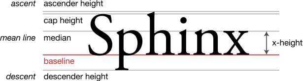
| 前任 | 相对于当前字体的 x 高度。 | 字体大小:4ex; |
| ch | 相对于“0”的宽度。 | 字体大小:4ch; |
| 雷姆 | 相对于根元素的字体大小。 | 字体大小:2rem; |
| 左 | 它是相对于元素的行高。 | 字体大小:4lh; |
| 鲁尔赫 | 它是相对于根元素的行高。 | 字体大小:4rlh; |
| 维赫 | 它与视口的高度相关。1vh = 视口高度的 1% 或 1/100。 | 字体大小:4vh; |
| 大众汽车 | 它与视口的宽度有关。1vw = 视口宽度的 1% 或 1/100。 | 宽度:4vw; |
| 最小电压 | 它是相对于视口的较小尺寸而言的。1vmin = 视口较小尺寸的 1% 或 1/100。 | 宽度:4vmin; |
| 最大速度 | 它是相对于视口的较大尺寸而言的。1vmax = 视口较大尺寸的 1% 或 1/100。 | 宽度:4vmax; |
| VB | 它相对于根元素块轴方向上初始包含块的大小。1vb = 包含块大小(块轴)的 1%。 | 字体大小:4vb; |
| 六 | 它相对于根元素内联轴方向上初始包含块的大小。1vb = 包含块大小的 1%(内联轴)。 | 字体大小:4vi; |
| 大众汽车、大众汽车 | 它是相对于较小视口的宽度和高度。1svw = 较小视口宽度的 1% 或 1/100,1svh = 较小视口高度的 1% 或 1/100。 | 宽度:40svw;高度:40svh; |
| 左室宽度、左室厚度 | 它是相对于较大视口的宽度和高度。1lvw = 较大视口宽度的 1% 或 1/100,1lvh = 较大视口高度的 1% 或 1/100。 | 宽度:40lvw;身高:40lvh; |
| dvw, dvh | 它是相对于动态视口的宽度和高度而言的。1dvw = 动态视口宽度的 1% 或 1/100,1dvh = 动态视口高度的 1% 或 1/100。 | 宽度:40dvw;高度:40dvh; |
示例 - em 单位
该单元设置相对于元素字体大小的大小:
<html>
<head>
<style>
   div {
      font-size: 20px;
      border: 2em solid green;
   }
</style>
</head>
<body>
   <div>
       This div will have a border of 20 * 2 = 40 pixels.
   </div>
</body>
</html>
示例 - 前单位
该单位设置相对于当前字体的 x 高度的大小:
<html>
<head>
<style>
   div {
      font-size: 20px;
      border: 2ex solid green;
   }
</style>
</head>
<body>
   <div>
       This div will have a border of 2 * x-height of the line.
   </div>
</body>
</html>
示例 - ch 单位
该单元设置相对于所选字体中“0”(零)字符宽度的大小。它主要用于创建随字体大小缩放的响应式设计:
在下面的示例中,我们将输入宽度设置为 10ch(这意味着它将显示 10 个字符)。尝试更改 font-size 值并查看输入内容如何仍然显示 10 个字符或数字。
<html>
<head>
<style>
   input{
      font-size: 2em;
      width:10ch;
   }
</style>
</head>
<body>
   <div>
      <input type="text" name="id" id="userID" placeholder="enter PIN">
   </div>
</body>
</html>
示例 - rem 单位
该单元设置相对于根元素(通常是 HTML 元素本身)的 font-size 的大小:
<html>
<head>
<style>
   html {
      font-size: 12px;
   }
   p {
      font-size: 2rem;
      border: 1px solid green;
   }
   span{
      font-size:24px;
      border: 1px solid red;
   }
</style>
</head>
<body>
    This is root element whose font-size is 12px.
    <p>This is child element whose font is 2rem which means 12 * 2 = 24px.</p>
    <span>This is child element whose font is 24px.</span>
</body>
</html>
示例 - lh 和 rlh 单位
lh单位设置相对于元素行高的大小。
rlh单位设置相对于根元素行高的大小。
以下示例演示了lh和rlh单位的用法(尝试将字体大小更改为 10px、2em 或 300%;在 body > div:first-of-type 中):
<html>
<head>
<style>
:root {
   font-size: 100%;
   /*
   Changing the value of line height also changes
   the used value for any declaration that uses
   line height units.

   In this case, it affects the entire document
   because this ruleset matches the root element.
   */
   line-height: 1;
}
body > div:first-of-type {
   /*
   Changing the font size here only affects the
   first two blocks of text. Those blocks of text
   use lh units.

   The last block of text use rlh or root
   line height units. Its text size gets calculated
   relative to the font size of the :root element.

   Try changing this to 10px, 2em, or 300%;
   */
   font-size: 1lh;
   display: grid;
   grid-template-columns: auto auto auto auto;
   gap: 24px;
   margin-block-end: 2rem;
}
.lh {
   font-size: 1.5lh;
   background: #87cefa66;
}
.rlh {
   font-size: 1.5rlh;
   background: #da70d666;
}
body > p {
   font-family: sans-serif;
   font-size: 1.5rem;
}
[lang] {
   padding: 5px;
}
[lang="en"] {
   font-family: "Lora", serif;
   align-self: start;
}

p {
   margin-block: 0 1rem;
}

</style>
</head>
<body>

<div>
   <div lang="en" class="lh">
      <p>Lorem Ipsum is simply dummy text of the printing and typesetting industry. Lorem Ipsum has been the industry's standard dummy text ever since the 1500s, when an unknown printer took a galley of type and scrambled it to make a type specimen book. It has survived not only five centuries, but also the leap into electronic typesetting, remaining essentially unchanged. It was popularised in the 1960s with the release of Letraset sheets containing Lorem Ipsum passages, and more recently with desktop publishing software like Aldus PageMaker including versions of Lorem Ipsum.</p>

      <p>Lorem Ipsum is simply dummy text of the printing and typesetting industry. Lorem Ipsum has been the industry's standard dummy text ever since the 1500s, when an unknown printer took a galley of type and scrambled it to make a type specimen book. It has survived not only five centuries, but also the leap into electronic typesetting, remaining essentially unchanged. It was popularised in the 1960s with the release of Letraset sheets containing Lorem Ipsum passages, and more recently with desktop publishing software like Aldus PageMaker including versions of Lorem Ipsum.</p>
   </div>
   <div lang="en" class="rlh">
      <p>Lorem Ipsum is simply dummy text of the printing and typesetting industry. Lorem Ipsum has been the industry's standard dummy text ever since the 1500s, when an unknown printer took a galley of type and scrambled it to make a type specimen book. It has survived not only five centuries, but also the leap into electronic typesetting, remaining essentially unchanged. It was popularised in the 1960s with the release of Letraset sheets containing Lorem Ipsum passages, and more recently with desktop publishing software like Aldus PageMaker including versions of Lorem Ipsum.</p>

      <p>Lorem Ipsum is simply dummy text of the printing and typesetting industry. Lorem Ipsum has been the industry's standard dummy text ever since the 1500s, when an unknown printer took a galley of type and scrambled it to make a type specimen book. It has survived not only five centuries, but also the leap into electronic typesetting, remaining essentially unchanged. It was popularised in the 1960s with the release of Letraset sheets containing Lorem Ipsum passages, and more recently with desktop publishing software like Aldus PageMaker including versions of Lorem Ipsum.</p>
   </div>
</div>

</body>
</html>
示例 - vh 单位和 vw 单位
vh(视口高度)单位设置相对于视口高度的大小。1vh = 视口高度的 1% 或 1/100。
vw(视口宽度)单位设置相对于视口宽度的大小。1vw = 视口宽度的 1% 或 1/100。
例如,我们将宽度设置为20vw,高度设置为20vh。假设视口宽度和高度分别为 1200px 和 1000px。在这种情况下,20vw 的值为 240px,20vh 的值为 200px。
<html>
<head>
<style>
   body {
      height:500vh;
   }
   .container{
      display:flex;
   }
   .box-1{
      background-color: lightgreen;
      height:50vh;
      width:50vw;
   }
</style>
</head>
<body>
   <div class="box-1"></div>
   <p>Resize the height of the browser window to see how the box-size (height and width) changes. 1vh = 1% of viewport height and width respectively.</p>
</body>
</html>
示例 - vmin(视口最小值)和 vmax(视口最大值)单位
vmin(视口最小值)单位设置相对于视口较小尺寸的大小。1vmin = 视口较小尺寸的 1% 或 1/100。例如,如果视口宽度为 1000 像素,高度为 800 像素。如果我们将元素的宽度设置为 30vmin,则它将是高度的 30%。所以 800px 的 30% 就是 240px。
vmax(视口最大)单位设置相对于视口较大尺寸的大小。1vmax = 视口较大尺寸的 1% 或 1/100。例如,如果视口宽度为 1000 像素,高度为 800 像素。如果我们将元素的宽度设置为 30vmax,则它将是宽度的 30%,即 300px。
   <html>
   <head>
   <style>
      div {
         box-sizing: border-box;
         color: white;
         margin-bottom: 4px;
         padding: 4px;
         overflow: scroll;
      }
      .vwvh {
         background: lightcoral;
         width: 60vw;
         height: 70vh;
      }
      .vmin {
         color: black;
         background: lightblue;
         width: 80vmin;
         height: 20vmax;
      }
   </style>
   </head>
   <body>
      <div class="vwvh">
         width = 50vw (50% of the viewport's width)<br />
         height = 30vh (30% of the viewport's height)
      </div>
      <div class="vmin">
         width = 80vmin (should be viewport's height)<br />
         height = 10vmax (should be viewport's width)
      </div>
   </body>
   </html>
示例 - vb 单元
该单元在根元素的块轴方向上设置相对于初始包含块的大小的大小。1vb = 包含块大小的 1%(块轴):
<html>
<head>
<style>
   body {
      font-size:20px;
   }
   .container{
      height:80vb;
  }
  p{
   font-size:50vb;
  }
</style>
</head>
<body>
   <div class="container">
   <p>Resize the height of the browser window to see how the font changes.</p>
</div>
</body>
</html>
示例 - vi 单元
该单元在根元素的内联轴方向上设置相对于初始包含块的大小的大小。1vi = 包含块大小的 1%(内联轴):
<html>
<head>
<style>
   body {
      font-size:20px;
   }
   .container{
      width:80vi;
   }
   p{
      font-size:5vi;
   }
</style>
</head>
<body>
   <div class="container">
   <p>Resize the height of the browser window to see how the font changes. 1vh = 1% of viewport height and width respectively.</p>
</div>
</body>
</html>
下面的示例演示了使用 <resolution> 数据类型,其中图像分辨率设置为 500dpi:
<html>
<head>
<style>
   img {
      width: 300px;
      height: 200px;
      margin-right: 0.5in;
   }
</style>
</head>
<body>
   <h2>Image Resolution dots per inch</h2>
   <h3>500dpi</h3>
   <img style="image-resolution: 500dpi;" src="images/pink-flower.jpg" alt="500dpi">
</body>
</html>
示例 - 百分比
百分比值始终与另一个值相关设置。例如,当百分比值作为元素的高度或宽度传递时,它将被计算为父元素的高度或宽度的百分比。
让我们看一个例子来更好地理解这一点。这里将百分比值传递给元素的高度:
<html>
<head>
<style>
   .main {
      height: 400px;
      border: 5px solid rgb(19, 12, 218);
      display: inline-block;
   }
   .box {
      border: 2px solid black;
      padding: 5px;
      margin: 10px;
      display: inline-block;
   }
   .length-value {
      height: 100px;
   }
   .percent-value {
      height: 40%;
   }
</style>
</head>
<body>
   <div class="box length-value">Box height is 100px</div>
   <div class="box percent-value">Box height is 40%</div>
   <div class="main">
   <div class="box length-value">Box inside the main box is 100px high</div>
   <div class="box percent-value">Box height is 40% of main box</div>
</div>
</div>
</body>
</html>
让我们再看一个使用百分比的示例,其中列表的嵌套值是根据父元素font-size的值计算的:
<html>
<head>
<style>
   .font-value {
      font-size: larger;
   }
   li {
      font-size: 60%;
   }
</style>
</head>
<body>
   <div>
      <h2>Beverages</h2>
      <ul>
         <li class="font-value">Tea
            <ul>
            <li>Assam tea</li>
            <li>Darjeeling tea</li>
            </ul>
         </li>
         <li class="font-value">Coffee
            <ul>
            <li>Hot coffee</li>
            <li>Cold Coffee</li>
            </ul>
         </li>
         <li class="font-value">Juices
            <ul>
            <li>Orange</li>
            <li>Mango</li>
            <li>Sweet Lime</li>
            </ul>
         </li>
      </ul>
   </div>
</body>
</html>
有些属性接受长度或百分比值,有些属性只接受长度。如果允许的值为<length-percentage>,则传递的值可以是长度或百分比;当允许的值为<length>时,传递的值只能是长度而不是百分比。
示例 - 数字
CSS 的某些属性接受数字形式的值类型,不附加任何单位。诸如不透明度、行高等属性。
例如,不透明度的值可以在0到1的范围内。
这是不透明度的示例:
<html>
<head>
<style>
   .wrapper {
      display: flex;
   }
   #common-style {
      background-color: #d3360b;
      width: 150px;
      height: 100px;
      border: 3px solid black;
      margin: 5px;
   }
   p {
      text-align: center;
   }
   .decimal-opacity {
      opacity: 0.4;
   }
   .opacity-0 {
      opacity: 0;
   }
   .opacity-1 {
      opacity: 1;
   }
</style>
</head>
<body>
   <div class="wrapper">
      <div class="decimal-opacity" id="common-style">
         <p>CSS Opacity to 0.4</p>
      </div>
      <div style="border: 2px solid green">
         <p>CSS Opacity to 0</p>
         <div class="opacity-0" id="common-style"></div>
      </div>
      <div class="opacity-1" id="common-style">
         <p>CSS Opacity to 1</p>
      </div>
   </div>
</body>
</html>
这是行高的示例:
<html>
<head>
<style>
   div {
      border: 2px solid black;
      width: 700px;
   }
   div.lh-integer {
      line-height: 1;
   }
   div.lh-decimal {
      line-height: 2.6;
   }
</style>
</head>
<body>
<h2>Line-height Property Values</h2>
   <h3>line-height: 1:</h3>
      <div class="lh-integer">The paragraph is with a whole value for line-height.<br>
      The line height for the text is set to 1, which makes the lines look close.
      </div>

      <h2>line-height: 2.6:</h2>
      <div class="lh-decimal">The paragraph is with decimal value for line-height.<br>
      The line height for the text is set to 2.6. It is a unitless value, with just the number.<br>
      The line height here is relative to the font-size.
      </div>
</body>
</html>